Quantile-Quantile Plots
Quantile-quantile plots are a useful tool for determining whether a measure is normally distributed. From Wikipedia:
Q–Q (quantile-quantile) plot is a probability plot, which is a graphical method for comparing two probability distributions by plotting their quantiles against each other. First, the set of intervals for the quantiles is chosen. A point (x, y) on the plot corresponds to one of the quantiles of the second distribution (y-coordinate) plotted against the same quantile of the first distribution (x-coordinate). Thus the line is a parametric curve with the parameter which is the number of the interval for the quantile.
Let’s begin with a vector of values, mpg from the mtcars data frame. The plot below is a histogram of values, density of mpg in black, and normal distribution in blue.
data(mtcars)
x <- mtcars$mpg
x <- x[order(x)] # Order the vector
ggplot(mtcars, aes(x = mpg)) +
    geom_histogram(aes(y = ..density..), bins = 10, fill = 'grey50') +
    geom_density() +
    geom_function(fun = dnorm,
                  args = list(mean = mean(x), sd = sd(x)),
                  color = 'blue') +
    xlim(mean(x) - 3 * sd(x), mean(x) + 3 * sd(x))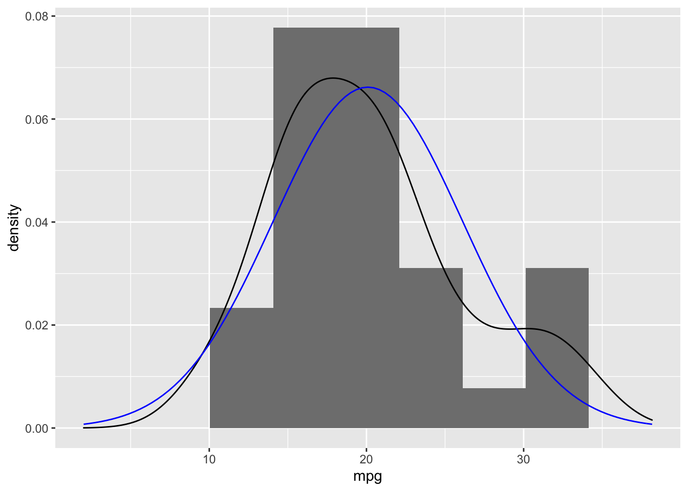
To calculate the theoretical quantiles, we start with a vector of length equal to the original data (i.e. n = 32 in this example). The ppoints generates a sequence of probability points that are equally distributed between 0 and 1.
( points <- ppoints(length(x)) )## [1] 0.015625 0.046875 0.078125 0.109375 0.140625 0.171875 0.203125 0.234375
## [9] 0.265625 0.296875 0.328125 0.359375 0.390625 0.421875 0.453125 0.484375
## [17] 0.515625 0.546875 0.578125 0.609375 0.640625 0.671875 0.703125 0.734375
## [25] 0.765625 0.796875 0.828125 0.859375 0.890625 0.921875 0.953125 0.984375Using the qnorm function we can calucate the quantile for each of these values.
( y <- qnorm(points) )## [1] -2.15387469 -1.67593972 -1.41779714 -1.22985876 -1.07751557 -0.94678176
## [7] -0.83051088 -0.72451438 -0.62609901 -0.53340971 -0.44509652 -0.36012989
## [13] -0.27769044 -0.19709908 -0.11776987 -0.03917609 0.03917609 0.11776987
## [19] 0.19709908 0.27769044 0.36012989 0.44509652 0.53340971 0.62609901
## [25] 0.72451438 0.83051088 0.94678176 1.07751557 1.22985876 1.41779714
## [31] 1.67593972 2.15387469mean(y)## [1] 0sd(y)## [1] 0.9960714Note that the mean and standard deviation are 0 and 1 (within rounding error), respectively, as would be expected from a standard normal distribution. We will no convert our observed values to z-scores and see how they pair up with the theoretical quantiles.
z <- (x - mean(x)) / sd(x)
df <- data.frame(ID = 1:length(x), Observed = x, Observed_z = z, Theoretical = y)
head(df)
## ID Observed Observed_z Theoretical
## 1 1 10.4 -1.6078826 -2.1538747
## 2 2 10.4 -1.6078826 -1.6759397
## 3 3 13.3 -1.1267104 -1.4177971
## 4 4 14.3 -0.9607889 -1.2298588
## 5 5 14.7 -0.8944204 -1.0775156
## 6 6 15.0 -0.8446439 -0.9467818ggplot(df, aes(x = Observed_z, y = 'Observed', xend = Theoretical, yend = 'Theoretical')) +
geom_point(aes(x = Observed_z, y = 'Observed'), color = 'red') +
geom_point(aes(x = Theoretical, y = 'Theoretical'), color = 'blue') +
geom_segment() + ylab('') + xlab('')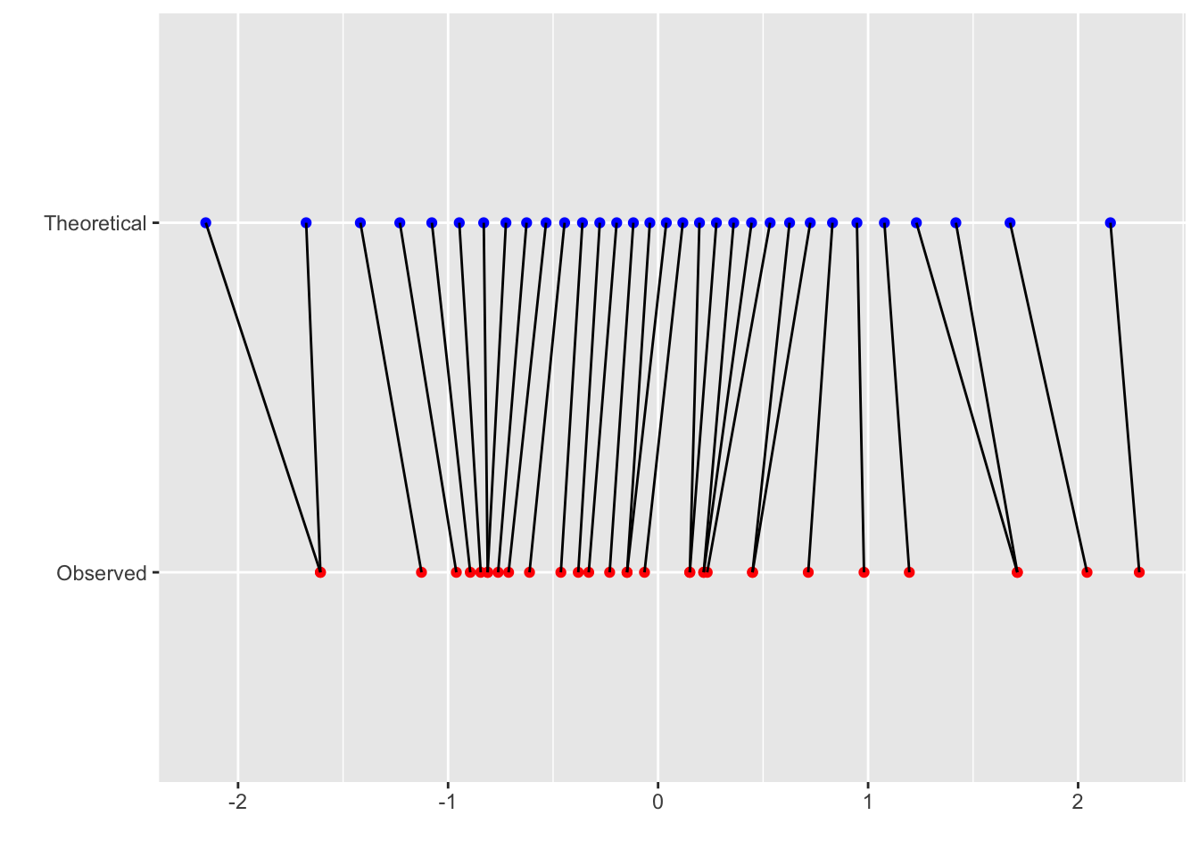
The points in blue are the theoretical quantiles and each is matched to a point in red which is the observed z-score. If the data points were perfectly normal, then all the lines would be vertical. The following plot shows the distributions of these to vectors.
ggplot(data.frame(Observation = c(rep('Observed', length(z)),
                                  rep('Theoretical', length(y))),
                  Value = c(z, y)), aes(x = Value, color = Observation)) +
    geom_density() +
    geom_rug() +
    scale_color_manual(values = c('Observed' = 'red', 'Theoretical' = 'blue')) +
    ylab('') + xlab('z-score')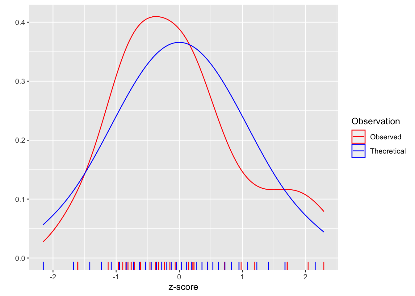
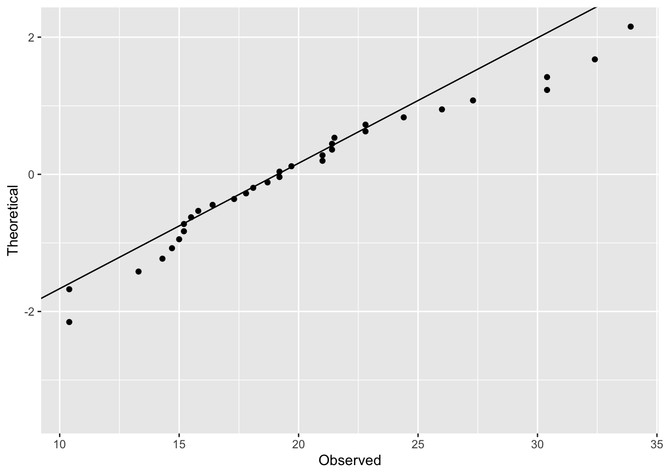
We can see that the distribution does vary from the normal. The q-q plot provides another way of visualizing the departure from the normal distribution.
ggplot(df, aes(x = Observed, y = Theoretical)) +
    geom_point()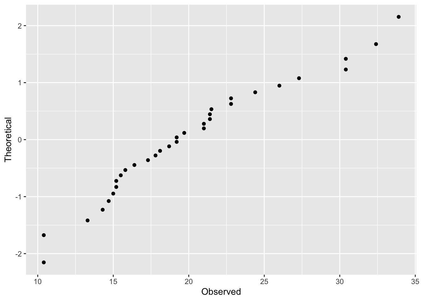
To add the line, we need to calculate the slope and intercept from two points that would fall exactly on the line if the distribution was perfectly normal.
( x2 <- quantile(x, probs = c(0.25, 0.75)) ) # Using 25th and 75th percetile, but any two would work.## 25% 75%
## 15.425 22.800( y2 <- qnorm(c(0.25, 0.75)) )## [1] -0.6744898 0.6744898slope <- diff(y2) / diff(x2)
int <- y2[1L] - slope * x2[1L]
ggplot(df, aes(x = Observed, y = Theoretical)) +
geom_point() +
geom_abline(slope = slope, intercept = int)